Pink Floyd - Dark Side of the Moon - 1973
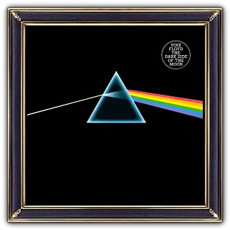
Of minor significance was the complete appropriateness of the artwork to the record. The design is simply a mechanical tint lay, which means we drew outline shapes, black on white, and indicated what colours were to appear when printed. The prisms were airbrushed black on white and reversed by the printer. The refracting glass prism referred to Floyd's light shows – consummate use of light in the concert setting.
Its outline is triangular and triangles are symbols of ambition, and are redolent of pyramids, both cosmic and mad in equal measure, all these ideas touching on themes in the lyrics. The joining of the spectrum extending round the back cover and across the gatefold inside was seamless like the segueing tracks on the album, whilst the opening heartbeat was represented by a repeating blip in one of the colours.