
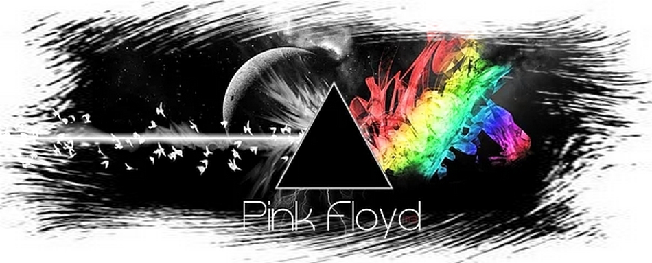


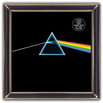
Pink Floyd - Dark Side of the Moon
Hey! Hello! What about this?

release - 1973
album art - Hipgnosis
Storm Thorgerson
George Hardie
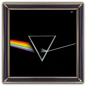
cover front
The cover art is produced by Hipgnosis with design by Storm Thorgerson and illustration by George Hardie.
In the words of Storm Thorgerson:
'The idea itself was cunningly cobbled from a standard physics textbook, which illustrated light passing through a prism. Of significance was the simple, elegant layout against black – standard textbook illustrations did not do this. Also important to the art direction, was the fortuitous decision to listen to Rick Wright, who suggested we do something clean, elegant and graphic, not photographic – not a figurative picture. And then to connect this idea to their live show, which was famous for its lighting, and subsequently to connect this to ambition and madness, themes Roger was exploring in the lyrics … hence the prism, the triangle and the pyramids.
The design is simply a mechanical tint lay, which means we drew outline shapes, black on white, and indicated what colours were to appear when printed. The prisms were airbrushed black on white and reversed by the printer. The refracting glass prism referred to Floyd's light shows – consummate use of light in the concert setting.
Its outline is triangular and triangles are symbols of ambition, and are redolent of pyramids, both cosmic and mad in equal measure, all these ideas touching on themes in the lyrics.
Storm Thorgerson

More Storm Thorgerson (via MediaBitch, his PR firm):
'Pink Floyd, in their infinite wisdom, perused our 7 complex detailed roughs for this cover in a drab basement room at Abbey Road – submissions over which we at Hipgnosis had toiled for weeks – but managed to decide within 3 minutes which one they liked. No amount of cajoling would get them to consider any other contender, nor endure further explanation of the prism, or how exactly it might look.
‘That’s it’, they said in unison, ‘we’ve got to get back to real work’, and returned forthwith to the studio upstairs. To look back now and reflect upon how the actual artwork itself had no colour, being just a tint lay, and how the spectrum was missing a colour anyway, and how the whole design was only cobbled from a standard physics textbook diagram .... all of this just goes to show how such matters pale if a design feels ‘appropriate’.
cover back
front-inside-back
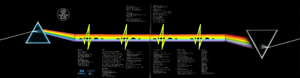
The joining of the spectrum extending round the front/back cover into the gatefold inside was seamless like the segueing tracks on the album, whilst the opening heartbeat was represented by a repeating blip in one of the colours.
artist
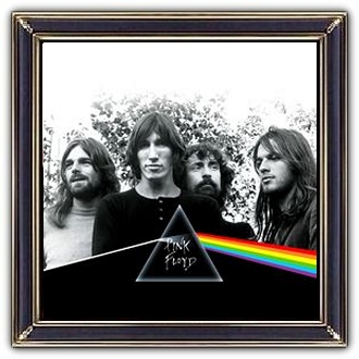
Pink Floyd was an English rock band formed by students Syd Barrett, Nick Mason, Roger Waters and Richard Wright. David Gilmour joined as a fifth member in December 1967; Barrett left the band in April 1968 due to deteriorating mental health. They achieved international acclaim with their progressive and psychedelic music.
Their most successful albums are Dark Side of the Moon (1973), Wish You Were Here (1975), Animals (1977), The Wall (1979) and The Final Cut (1983).
Wright left in 1979, followed by Waters in 1985. Gilmour and Mason continued; Wright rejoined later. The three produced A Momentary Lapse of Reason (1987) and The Division Bell (1994) and toured until 1994. The Endless River, based on material recorded in 1993–1994, was released in November 2014.
also in gallery